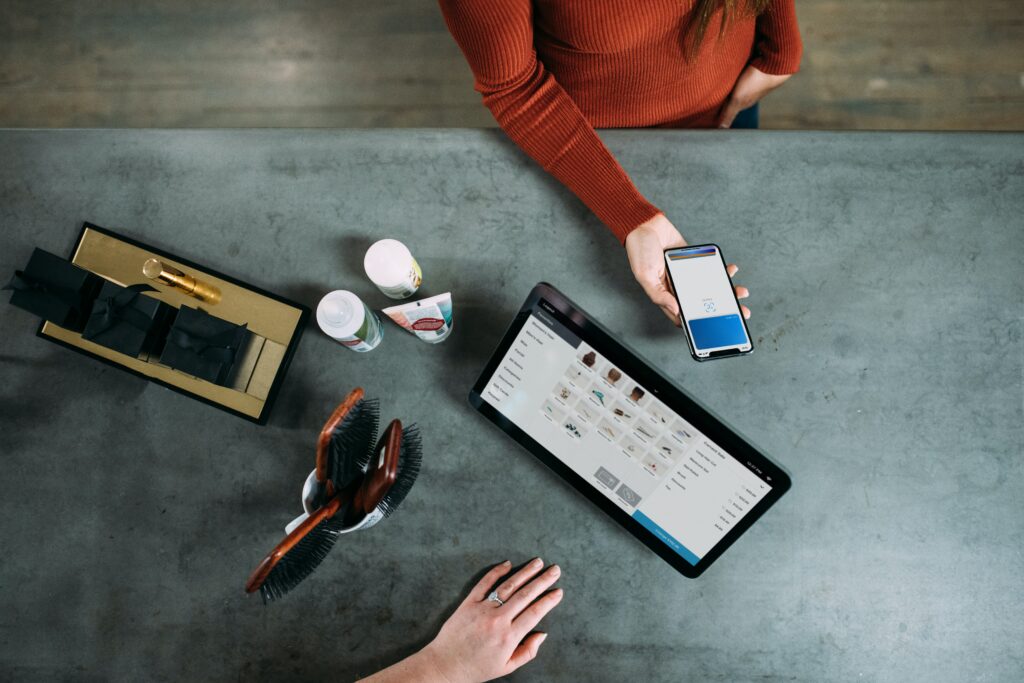
Shopping on mobile devices has become dramatically more popular in recent times. It’s now estimated that around 53.9% of all online purchases are made from a mobile device. This makes a huge difference in how many e-commerce businesses are designing their websites and Amazon Storefronts.
Your Amazon store will look different on a mobile device than it will on a PC or laptop. This is important to keep in mind as any tactics and strategies you employ to persuade customers to buy from your store, may not work as well if things look too different. That’s why it’s a good idea to optimize your Amazon store for mobile.
Think About Product Placement Order
On mobile devices, there is less screen space to promote your products. The first few products that customers see can make a big difference in their decision to make a purchase or not. It’s for this reason that it can be a very good idea to make sure your best selling products are the first ones to be seen.
You should also think about how you organize and place your products throughout your Amazon store. On mobile devices, your menu bars won’t be there. Instead, you’ll need to make the best use possible of a dropdown menu. Categorizing your products effectively and offering solutions to your customers’ problems quickly and easily can go a long way in convincing them to make a purchase.
Confusing categories and menu options can quickly put people off. The products that are placed in each category should fit in perfectly with others in the same category to avoid any confusion or frustration.
Use A Mobile Specific Header Image
You can upload a header image that will specifically be used for people accessing your store on mobile devices. The header image is a great place to show off what your business is all about as it’s one of the very first things visitors will see. It’s worth remembering though that the resizing process your store will dynamically go through when being accessed on mobile can alter how you think your header image will appear.
With this in mind, keeping the number of products shown in the image to no more than 3 can help prevent your header image from looking cluttered and disorganized. The amount of text in the image also needs to be carefully considered. Around 30 characters seem to work most effectively. This allows you to use a large enough font to be easily read, without taking over the entire image with text.
Be Strategic With CTA Placement
Any call to action (CTA) that you want your customer to respond to will need to be carefully placed on your mobile-friendly Amazon store. While placing a CTA towards the lower end of certain pages might look nice from a design perspective, when it comes to purchasing on mobile devices, customers probably won’t see the CTA without scrolling down the page. While this might not sound like a big deal, customers want an easy buying experience. The majority of customers will usually make their decision to stay or leave your store within the first 30 seconds of their visit. That doesn’t give you much time to encourage them to buy from you.
Having clear CTAs that are visible, accessible, and extremely obvious in their purpose will help make the best use of those first few seconds a customer takes to decide to stay. Having some space around them can help your CTAs to stand out which can make them more effective. If a customer can buy the product they want almost immediately upon visiting your Amazon store, you will very likely see an increase in sales because of the ease of purchase you’re offering your customers.
Keep Written Content Short And Engaging
As you have more limited screen space to showcase your Amazon store on mobile, you need to make the most of all the space available to you. While most of the screen will probably be taken up with images of your products, there’s still a need for some written content to be there too.
Obviously, you will need well-written, precise, and engaging product pages that explain what each product is, what it does, and why your customers need it, but written content should go beyond that. Simple things like an about page where you share a brief explanation of what your business does and the types of products you specialize in can be a useful tool for encouraging customers to make a purchase.
Any written content should be straight to the point. On mobile, there isn’t much screen space available to you so filling it with words is probably not your best strategy. Lots of high-quality images and highly engaging (but brief) written content seem to be a much better use of the space.
Test Your Amazon Store On Mobile Devices
No matter how many positive changes you make to your Amazon store, you’re never going to know exactly how it looks on a mobile device without testing it on one yourself. You can easily check how your store looks through the preview options on the store builder. This can be a great way of seeing how any changes will actually look when you put them live.
Sometimes though, the best thing to do is to visit your store on a mobile device as a customer would. By doing this, you get to see exactly what they will see and experience exactly what they will experience. Previews are useful but real-time tests are extremely beneficial and can highlight errors that you otherwise might miss.
Things to look out for include any text that overlaps other text, images that are too small or too big, all text is readable, and CTAs are clear and work as intended.


