
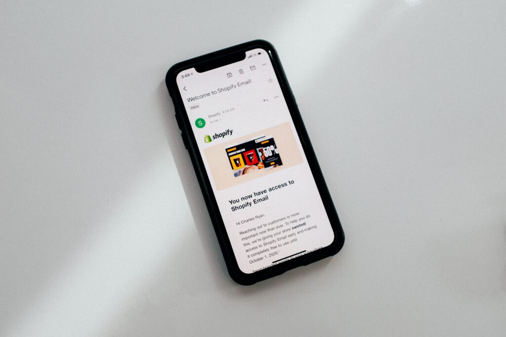
When it comes to running an e-commerce website, Shopify is a very popular platform to use. It allows you to set up and run a responsive website that automatically adapts and resizes depending on what kind of device it’s being viewed on.
While responsiveness is important when it comes to mobile optimization, there are other factors that can impact how your Shopify store looks on cell phone and tablet screens. When you think that more than $360 billion dollars were spent via shopping on mobile devices in 2021, you can quickly see why fully optimizing your Shopify store for handheld devices can make a big difference to your business.
If your Shopify store is poorly optimized for mobile, your SEO ranking will likely be much lower than it could be, your business could look bad in front of potential new customers visiting your site for the first time, and sales figures could be way down compared to your competitors.
All of these things obviously need to be avoided if you want to run a successful e-commerce business. That’s why understanding how to optimize your Shopify store for mobile is so important.
Think About the Size of Clickable Features
There aren’t many things more frustrating than trying to click a button or an image on a website only to find you accidentally clicked the button next to it instead. This can quite easily happen on mobile devices if the clickable features are too small or placed too close together.
Finding the best size for clickable buttons can take some trial and error but studies have found that buttons between 42 and 72 pixels seem to increase accuracy. This size allows for customers to quickly click on exactly what they want while still being a suitable size to not take up too much room on the screen.
Making sure there is sufficient space between any clickable features can also help to ensure that your customers can click on the one they actually want to and not one that is placed too close to it. The same study that found the most efficient size of clickable features also found that 12 to 48 pixels of space between each clickable feature seemed to work very well.
Text is Important
There are a couple of things to keep in mind when it comes to the text you use in your mobile-optimized Shopify store. The first is the size of the text used. Despite there being limited screen space on mobile devices, any text will need to be large enough for customers to be able to quickly read and understand.
A font size of at least 16 pixels seems to be most effective for mobile device screens. If the font you’re using is smaller than this, your customers will likely have to zoom in to read it properly which can be frustrating.
Another consideration when it comes to text is the amount of it you use. Obviously, you need to share all the important information about your products and business with customers, but keeping the amount of text down to the bare minimum on each page can help your Shopify store be more mobile-friendly.
Menus Take Up a Lot of Space so Hide Them
Your Shopify store menus may look good on a desktop but they can take up a lot of space on the screens of mobile devices. As the space you have is limited, taking it up with menus is probably not the best idea. Instead, collapsible menus tend to be a good solution.
Whether you go for a hamburger menu, a drop-down menu, or the 3 dots menu icon, customers can click on them and all of the options in the menu will then appear for them to choose from. This still gives your mobile customers exactly the same options as desktop customers without taking up a whole load of screen space.
Don’t Hide the Important Features
Although hiding your menus using collapsible options saves a lot of screen space, there are still certain navigational options that tend to be beneficial to leave visible throughout your customer’s time in your Shopify store. A call-to-action such as an “add to cart” or “buy it now” is useful to have available at all times. This allows a customer to make a purchase no matter what else they see on the screen.
A link back to your store homepage and directly to the shopping cart and checkout can also help customers through their buying journey. One of the key components of optimizing your Shopify store for mobile is that you have the right things visible while minimizing others to make the best use of the limited screen space available to you.
Keep Store Navigation Simple
Giving your customers lots of options can be a good thing. However, when it comes to navigational menus and options – less definitely appears to be more. Having multiple menus, options, and sub-options can quickly confuse or even frustrate a customer. Most customers will likely want to quickly browse your store and purchase what they want as easily as possible, lots of clicking and navigational options don’t help this to happen.
If too many of your customers get frustrated and leave your site, your bounce rate increases which can have a detrimental impact on your SEO ranking. The most efficient way of keeping things simple is to have one navigational menu that can take your customers to all the important parts of your store in one place.


